Katapult Studio
Katapult is a Betaworks-backed digital entertainment company building games and creative apps for kids.
Lead Design Researcher
When I joined Katapult as a design researcher, the startup was struggling to retain and grow its user base for Kandu, an iPad app that let kids create games and interactive art. I did an initial heuristic evaluation and research round to identify the main problems and learned that the app needed some significant changes. Shortly afterward, the app was dropped, and the company underwent an ideation and product discovery phase to figure out its next product.
Every other week, I recruited kids aged 7-14 and held research sessions getting feedback on thematic functional prototypes built by our developers. I then presented my findings back to the team, and the developers would modify and improve their prototypes. Over the course of 3 months, we interviewed over 100 kids, and eventually created CHKN, an open-world sandbox game that resembles a mashup of Minecraft, Pokémon and Tamagotchi.
KANDU CASE STUDY
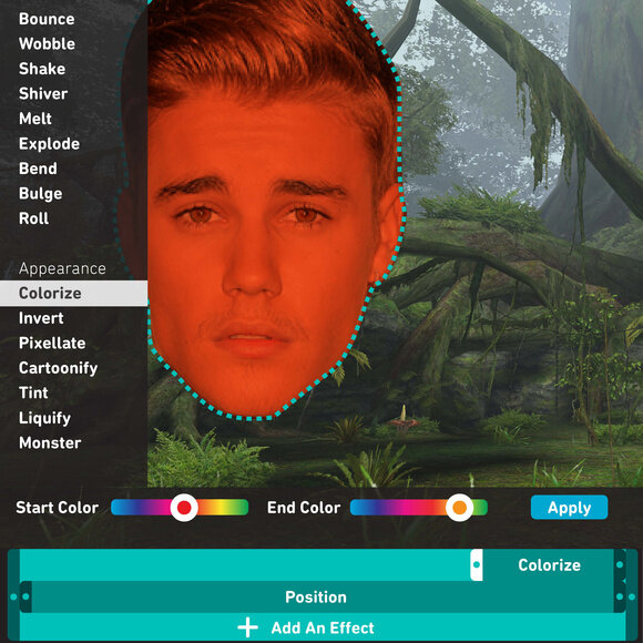
Kandu was an iPad app that let kids build games and interactive experiences using coding logic. After playing around with the app, it was evident that Kandu had many usability flaws, exemplified by the convoluted user flows, which were never mapped out before development.


I organized and conducted several one-on-one research sessions, utilizing cognitive walkthroughs to identify key pain points for new users. I recruited research participants of varying demographics and had them navigate through the app, performing several tasks:
open the app and use it for 10 minutes without any instruction
make a kandu, adding at least one behavior
make a kandu, adding at least one event
Afterward, I identified the usability issues and prioritized them, bucketing them by frequency.

FINDINGS
“It seemed rather pointless, and it wasn’t simple, so for something to be pointless, it should be simple.”
“I could see the whole concept being really fun. It’s like one of those things that once you know how to use this, it could be great, but the learning curve is steep.”
Kandu is a robust tool that gives users a lot of agency in building and creating. However, in its current state, it is extremely complicated to use. The target demographic (kids aged 7-11) will particularly have trouble learning how to use Kandu because of four distinct issues.
ISSUE #1
There is no onboarding. Users open the app and have no idea what to do.
“I feel like a monkey being given technology for the first time to be honest.”
“I don’t know, I’m just hitting buttons. There is nothing that explains to me what I’m exactly doing with this program.”
The lack of any substantive onboarding greatly inhibits first-time users. Users did not immediately know what they could or should do in the app — look around Planet Kandu? tap “Create New”? visit “My Workshop”? — and eventually lost interest or became so frustrated that they didn’t want to continue using Kandu.
Planet Kandu further added to the confusion because the featured kandus all work differently; some require users to play them while others are only meant to be watch.
As a result, users did not realize that there were two clear paths of usage: playing kandus and making them. They aimlessly explored Planet Kandu, and eventually tapped “Create New” because that button was the only clear prompt on the homepage.
RECOMMENDATION
Users need information upon entering the app. Design several welcome screens users must tap through when they first open the app that will give them an overview of what they can do and will want to do in Kandu (benefits onboarding).
Something along the lines of:
[1] Welcome to Kandu! A place where you can make and play games
[2] Explore Planet Kandu and play other people’s games
[3] Make your own game and submit it for other people to play and share
ISSUE #2
Users did not find the tutorial format ideal nor the content useful.
“The tutorial was not helpful in figuring out what I wanted to do.”
When users entered the workspace, they quickly skipped through the tutorial, not stopping to read through each page. As a result, users weren’t sure what to do when they were dropped into the blank workspace at the end.
Users also explained that they paid less attention to the tutorial because of the aesthetic. With a white background and minimal grey illustrations, one participant thought the graphics were decorative rather than instructive.
Users admitted that in general, they rarely read through forced tutorials out of habit, so they want a way to bring up the tutorial later on (no one found the existing tutorial button, masked as a paintbrush on a separate screen).
RECOMMENDATION
Users need an unobtrusive tutorial they can pull up when they need help, so a tutorial button should be available in the workspace (not 3 taps away on the publish screen).
In addition, the tutorial needs to be more detailed, specifically explaining to users how to build a kandu, and especially highlighting the three-step building process. An interactive tutorial would be ideal, where users can repeat actions as they learn them, but a clear and concise video tutorial could also work.
ISSUE #3
Users did not grasp the three-step building process in Kandu, and were further confused by the information architecture of the workspace.
“It worked, I don’t know why.”
“Now that I’ve got things in there, how do I make them move?”
Kandu’s three-step building process —[1] Add assets [2] Add behaviors to the assets [3] Set up events between the assets — is not explained in the app anywhere outside of the tutorial. Because of this, users did not understand the logic necessary to build more advanced kandus.
This was further compounded by the fact that the assets (artwork, backgrounds and interface & text), behaviors and effects are all contained in one sidebar menu. Without a distinct demarcation between these categories, users expected all items to behave the same way when added to the workspace. They did not know that assets, behaviors and effects have different functionalities, and additionally had trouble articulating the relationship between these categories.
Users did not intuitively find the Event Manager, as it is represented by a mysterious stoplight found outside of the main sidebar menu. They did not realize that their event options per asset were dependent upon the behaviors added to those assets prior to opening the Event Manager.
Moreover, users found the additional menus — the left sidebar menu used to adjust the appearance and behavior settings and the character-dependent menus— more than overwhelming because of the extensive customization options.
RECOMMENDATION
A redesign of the workspace is needed to complement the three-step building process, and ensure that the menus never entirely obscure the canvas.
Artwork, behaviors and events should be separated and placed in different locations on the workspace to clearly exemplify their different functionalities.
The workspace offers a plethora of customization options, some of which will rarely be modified by the majority of users. Menus should be simplified and tailored to our targets user group.
ISSUE #4
The terms and wording used in the app do not make sense.
“[Behaviors, Physics…] I know what they mean, but what do they mean in Kandu?”
Users had difficulty making quick changes or setting up the simplest reactions (e.g. make Character 1 disappear when Character 2 hits it) because they could not easily understand the terms used in Kandu. Words like physics, runtime, sensing, drag and bullet are all words they’ve encountered in everyday life, but could not predict what effect they would have in the app.
Users also found the customization settings for each character, behavior and effect a bit distressing because of the scientific nature of the language. Units are in meters per second, and locations are in x and y coordinates.
RECOMMENDATION
The tone of the terms should be less science-specific to appeal to a wider audience. For example, “Gravity” is less intimidating than “Physics,” to non-science types. Terms should also be reexamined for clarity. Words like “Sensing,” “Physical,” and “Move Recorder” need to be replaced with more digestible and explanatory terms.
CHKN CASE STUDY
After Katapult dropped Kandu, I established an iterative ideation process for the company to guide it during its product discovery phase. The developers created functional prototypes based on the goals and needs of our user archetypes, and I recruited for and lead research sessions with kids aged 7-14. Based on my insights, the developers would modify and improve their prototypes and over the course of 3 months, we interviewed over 100 kids.
Keeping in mind the mission of the company (to give kids new, innovative ways to play together) and considering what we knew about kids' digital behavior, I developed four use cases for a new Kandu product with Insight Strategy, a research consultancy with expertise in child and adolescent development and psychology.
Use Cases
[1] As a 7-10 year old, I would like to create something from scratch in order to satisfy my needs of mastery and imagining.
[2] As a 7-10 year old, I would like to explore parallel worlds to collect and pretend.
[3] As a 11-14 year old, I would like to share something interactive with my peers in order to receive social validation and capital.
[4] As a 11-14 year old, I would like to build something expressive to start conversations in new ways.

Research Questions
What is the motivation behind level-based gaming?
Can a level-based game inspire creation?
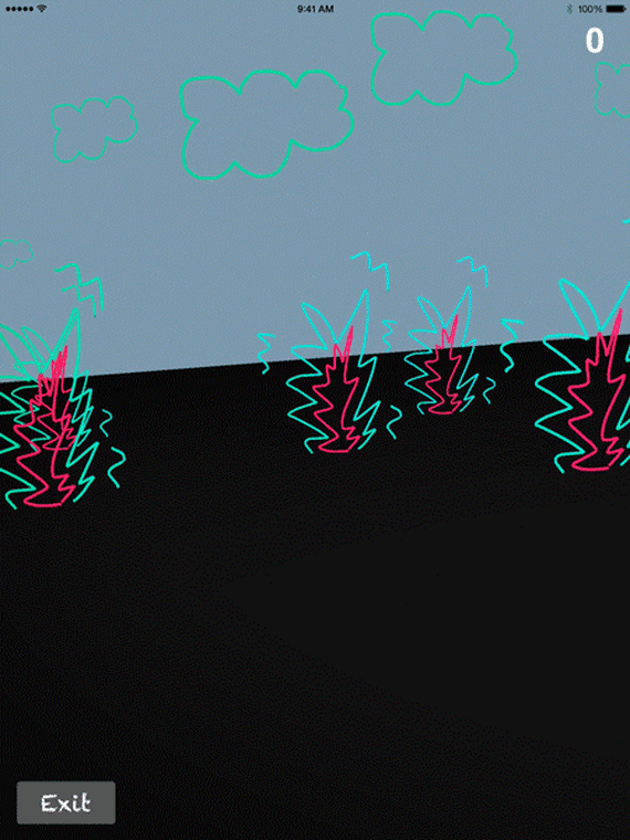
Prototype
The Incredible Machine-inspired prototype gave kids freedom within constraints. Users were driven to play because of the desire to level up and take on a new challenges, but the gameplay allowed for multiple solutions encouraging creative responses.

Research Questions
What is the motivation behind open-ended gameplay?
What do kids want to do while exploring worlds? How much functionality do they need?
Prototype
An evolution of the Kandu builder, this prototype fostered immersive, 3D building experiences. Kids filled their worlds with different objects and could play around with the “brains” i.e. customize their behaviors and effects. They could also set up games.
Research Questions
Do kids want to make and share animated content?
How easy should the creation process be?
Prototype
The GIF maker let kids make sharable, animated content that was compatible with existing social platforms. The customization options were limited and simple to expedite the making process.

Research Questions
What content do kids want to share?
Are they more interested in playing gatekeeper or actively sharing?
When would kids get bored of it?
Prototype
Spread It was a social network where users decided to pass on content [Spread It] or not [Kill It]. Users collected points, and social maps let them view the reach of their images.
EMERGING THEMES
After analyzing the research, I noted several themes.
Personalization: Kids want to use their own images and assets (and are particularly drawn to using selfies).
Customization: Kids enjoy different amounts of control. Some want to decide each detail, while others desire the basics.
Iteration: Kids like to do, undo, and do again.
Collaboration: Kids are extremely drawn to working with their friends and family.
Working with Insight Strategy, we then identified different levels of play and creation within our target user group
SOLO: play alone
PARALLEL: play side by side
SOCIAL: play together
NOVICE: As a Novice Builder, I would like to choose my way to achieve a goal so I can feel proud.
INTERMEDIATE: As an Intermediate Builder, I would like to customize something that is both personal and professional-looking that I can bond with my friends over.
MASTER: As a Master Builder, I would like to create something from scratch that demonstrates my skills and personality so that I can publish it, go viral, and maybe become famous.
FINDINGS
Because our target users fell on a spectrum of Novice, Intermediate and Master builders and sharers, we designed several functional prototypes in Unity and Swift that met the varied needs of these different users.
On a biweekly schedule, I interviewed kids one-on-one or in paired research sessions, having them engage with these prototypes. After analyzing their responses and actions, I reported key takeaways back to the team, and the developers would iterate on their prototypes, completing a new version for the following week of interviews.

COLLABRADOODLE
With minimal features – a pencil, eraser and additional colors – kids could draw frame-by-frame animations with Collabradoodle. Kids loved how their flat drawings popped off the page in the three-dimensional presentation view. Kids wanted to make quick, funny animations or spend more time making animations they were proud of.
The single-player mode was most interesting to kids who self-identify as creative or artsy, but kids felt that the timed multiplayer mode lowered the bar and created a level creative playing field.
COLLABRADOODLE WORLD
An offshoot of Collabradoodle, Collabradoodle World let kids navigate through worlds entirely composed of their hand-drawn assets populating the world at random. Game mechanics were built in so kids could set up timed or point challenges.
Kids were very passionate about gamifying their worlds, and they wanted to share these games with friends. They enjoyed the amount of control they had to completely customize their worlds.

SKETCHEE WORLD
First conceived as a technical prototype, Sketchee World let kids draw in a 3D space. Users could extrude complete shapes, which would then succumb to gravity and other physics principals.
Unlike Collabradoodle, Sketchee World’s main appeal was the creation experience rather than the end product creation. Kids enjoyed drawing and wandering amongst their 3D drawings.

FISHBOWL
Fishbowl immersed kids in a 3D world that let them “play god.” Kids were drawn to the expectancy violation, and they wanted to test things out that didn’t exist in real life, e.g. give a pig wings. Fishbowl had the potential for real-time multiplayer gameplay, and users could export snapshot videos to iMessage.
While the kids were very engaged during the research sessions, almost all of them said they would grow bored of Fishbowl over time because of its complete open-endedness – there were no goals, objectives or challenges.
FINAL PRODUCT: CHKN

Loosely inspired by the old Kandu builder app and Fishbowl prototype, and drawing upon our learnings from months of research, our Unity developers pitched another concept called CHKN.
CHKN is an open-world sandbox game where players create living, breathing creatures block by block, with each creature developing its own unique personality and emotions. Players are creators, explorers and caretakers. CHKN uses empathic intelligence as a core mechanic, creating a feeling of true attachment to creatures, and it is this bond that allows players to explore new lands, find resources and survive. CHKN is about creation and empowerment, surprise and humor.